Decent Technologies Homepage design review · 23 September 2026

Four directions for the Decent homepage.

Every direction below carries the same approved content and the same navy and logo-red palette. What changes is the visual language: how the page opens, how type is set, how photography is treated and how it behaves as you scroll. Pick the one that feels like Decent — the remaining fifteen pages will be built in whichever direction you choose.

Directions
04 parallel
Shared palette
Navy #1B2E44 · Red #BC2B38
Page state
Design comp, not live
Next step
Choose one direction

01

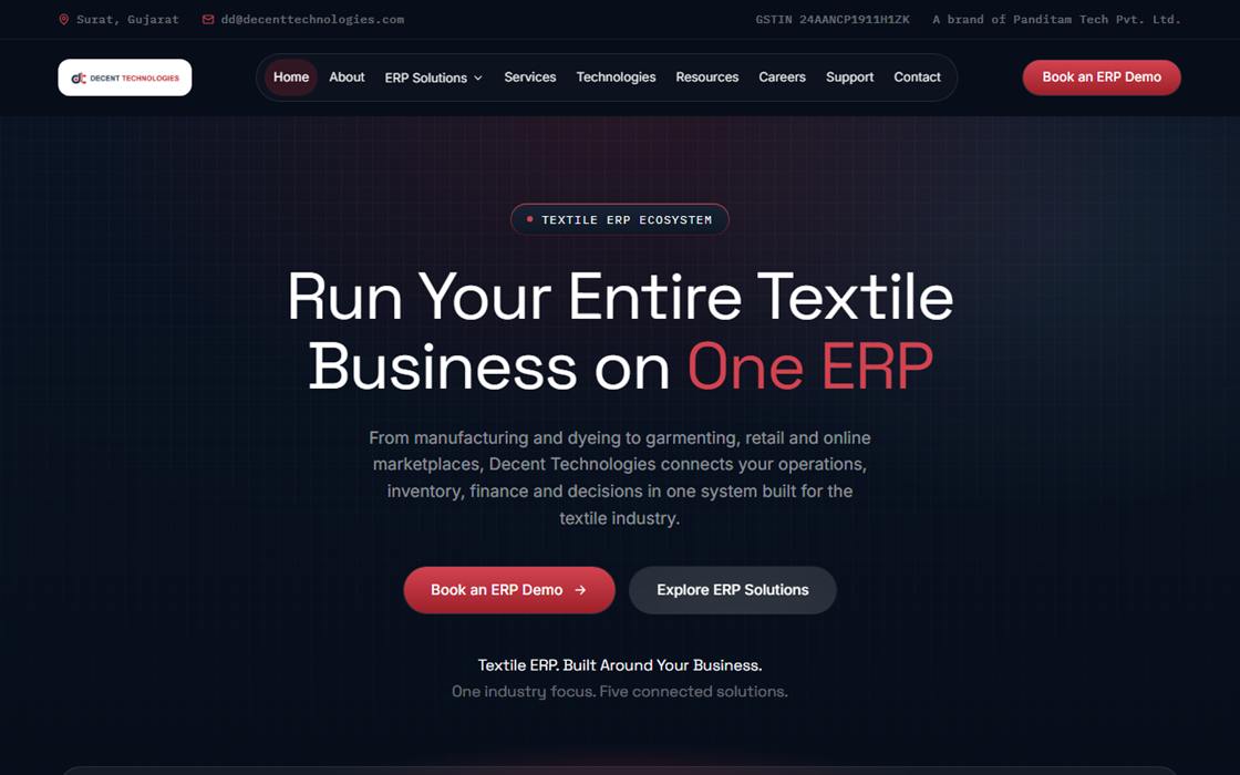
Dark enterprise

The quietest of the four. Dark throughout, generous space, one accent colour used sparingly. Reads like enterprise software rather than marketing.

Ground
Dark navy, edge to edge
Display type
Space Grotesk, light weights at large sizes
Photography
Minimal — type and space carry the page
Scroll behaviour
Scrubbed timelines, two pinned sections
Best if
You want Decent to feel serious and understated
Open direction 01
Direction 01: a dark navy homepage with a centred headline reading Run Your Entire Textile Business on One ERP

02

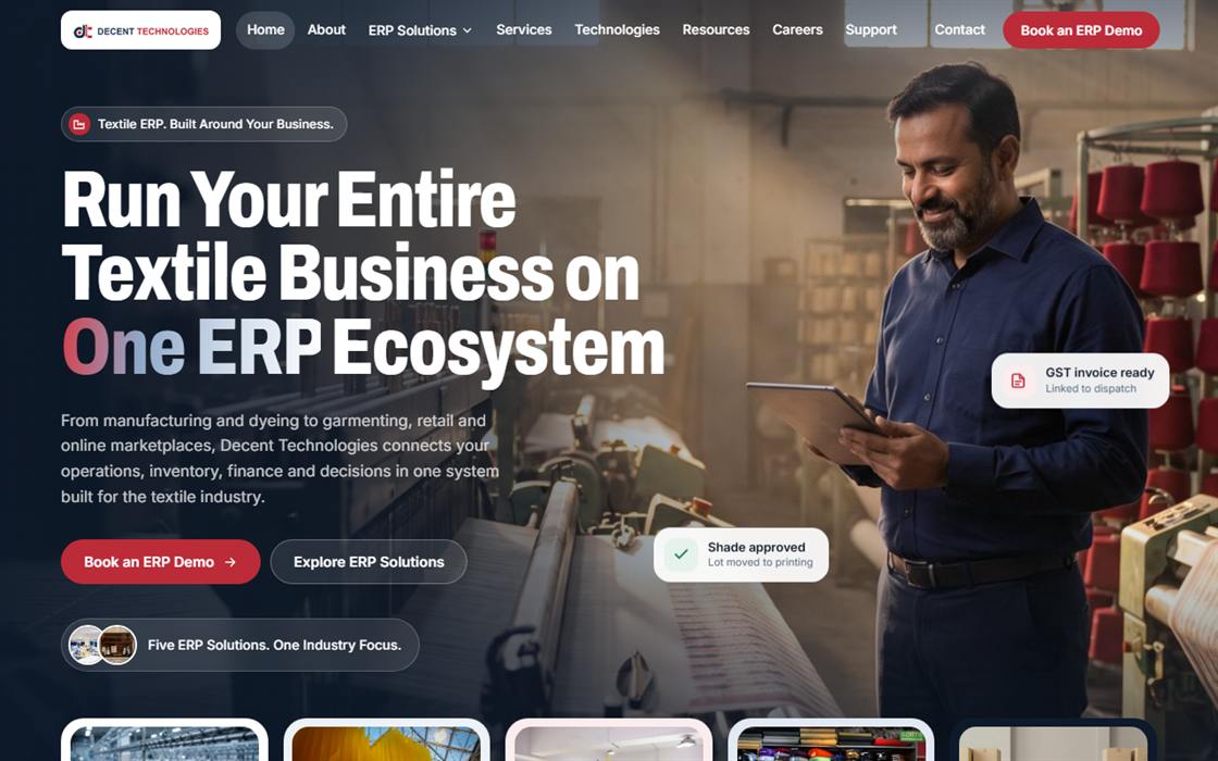
Light and photographic

The most commercial of the four. A full-bleed mill photograph behind the headline, with small status chips floating over it to hint at what the software does.

Ground
White and pale navy tint
Display type
Heavy condensed sans, very large
Photography
Dominant — photo-led hero and tile grid
Scroll behaviour
Spotlight cards, sideways photo strip
Best if
You want warmth and immediate product appeal
Open direction 02
Direction 02: a light homepage with a large photograph of a mill floor behind a heavy condensed headline

03

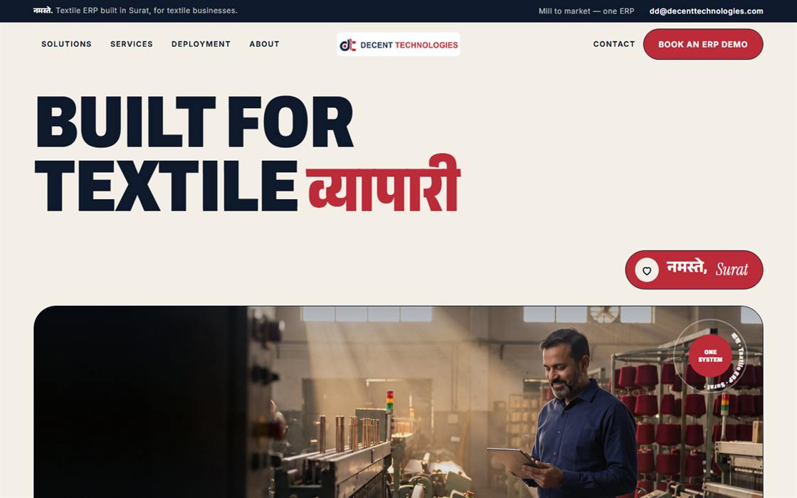
Editorial, Indian textile

The boldest of the four and the only one with a local voice: English headlines carrying a single Devanagari word — व्यापारी, सवाल, कदम — set on a warm cotton-paper ground.

Ground
Warm cotton / khadi paper
Display type
Heavy condensed caps with a serif italic accent
Photography
Staggered editorial grid, full-bleed band
Scroll behaviour
Rotating seals, snapping rail, word marquee
Best if
You want Decent to read as unmistakably Surat
Open direction 03
Direction 03: a warm cream homepage with the headline Built For Textile followed by the Hindi word vyapari in red

04

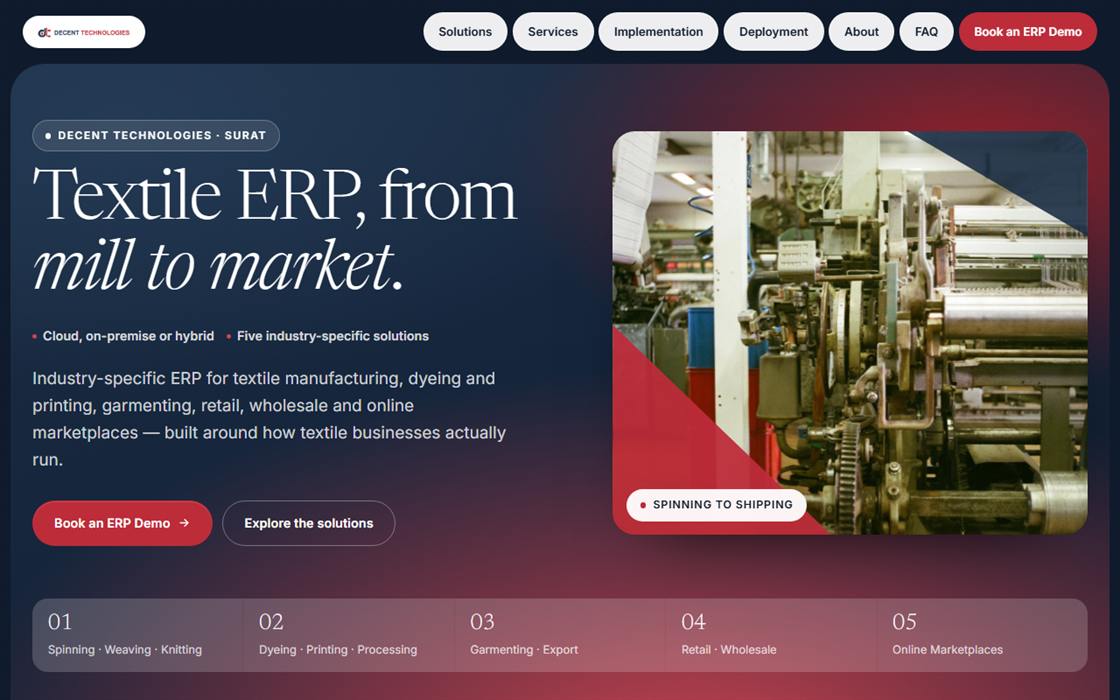
Serif-led, mesh gradients

The most modern of the four. A light serif headline over soft navy-to-crimson gradient fields, with solutions shown as a honeycomb of hexagon tiles. English only.

Ground
Navy–crimson gradient fields, cool paper
Display type
Newsreader, a light serif with italic accents
Photography
Hexagon tiles under a navy/red colour plate
Scroll behaviour
Diagonal wedge sweep, drifting honeycomb
Best if
You want a premium, current, editorial feel
Open direction 04
Direction 04: a navy to crimson gradient homepage with a light serif headline reading Textile ERP, from mill to market

Identical in all four

What is not up for debate

Over to you

Five things we need back

The first is the decision. The rest are small, but they all affect how the chosen direction is finished, so the earlier we have them the better.

01

Which direction should we build out?

Whichever you pick becomes the template for the remaining fifteen pages. Mixing elements across directions is possible, so tell us if something in one belongs in another.

02

Direction 03 — warm paper, or cool like the rest?

It currently sits on a warm cotton ground rather than the cool blue-white used by 01, 02 and 04. It is a one-line change either way. Only relevant if you choose 03.

03

Sign off the comparison wording.

Directions 03 and 04 include a panel contrasting a textile-specific ERP with a generic one. It is written carefully, but it does characterise other products — please read it and confirm you are comfortable publishing it.

04

A transparent version of the logo.

The file we have has a solid white background, so on dark sections the mark has to sit on a white tile. An SVG or transparent PNG would let it sit directly on the navy. This is the single most useful asset you could send us.

05

Real photography of your own.

Several images here are stock or AI-generated stand-ins, including every photograph with people in it. None of them show real staff, customers or premises, and all of them should be replaced with your own photography before launch.